1 / 15
XL
XL books are at least 34 cm (13.4 in.) high, with the exception of landscape-format titles
Logo Beginnings
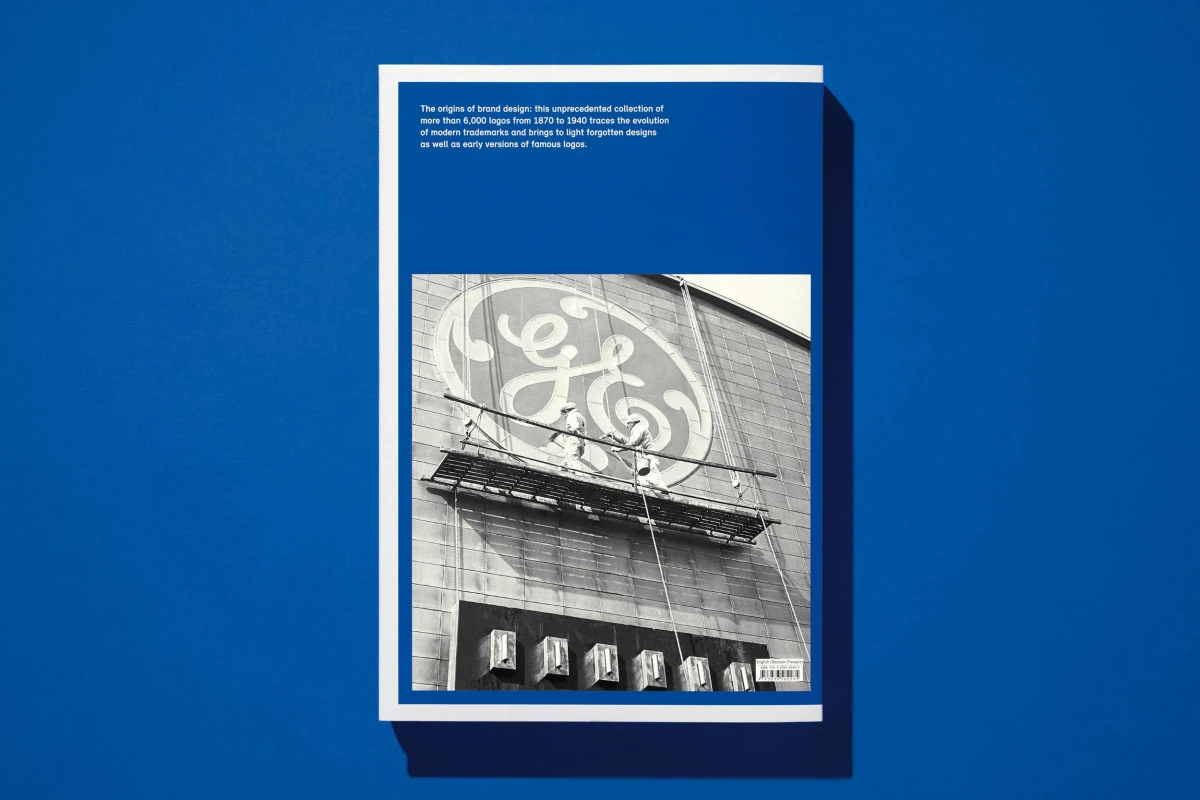
80Edition: Multilingual (English, French, German)Availability: In StockGlobal brands such as Rolex, BMW and Louis Vuitton are still using logos designed over 100 years ago. This book goes into the origins of modern trademarks and gathers over 6,000 logos from the mid-1800s to 1940. This is Jens Müller’s extensive complement to Logo Modernism and a must for those interested in branding and its influence.
Hardcover, 9.7 x 14.6 in., 8.14 lb, 432 pages
“…[a] magisterial new book on the history of corporate identities.”
“One for graphic designs and semioticians alike… As a chronicle of the birth of corporate identity, it can’t be beaten.”
“Fascinating stories behind the world’s oldest logos.”
“A good logo is one you can draw from memory in the sand with your big toe.”
“A trademark should be so distinctive that each time a firm’s name is mentioned the design springs into one’s mind.”
XL
XL books are at least 34 cm (13.4 in.) high, with the exception of landscape-format titles

Logo Beginnings
80First Signs
The origins of modern logos
Countless global brands, including Rolex, BMW, Louis Vuitton, and the New York Yankees, still use logos that were designed over 100 years ago. Yet there has never been a monograph devoted to the origins of logo design. In the second half of the 19th century, the trademark replaced traditional symbols such as the family coat of arms as a promotional and identifying symbol for companies. At first, the designs were often still figurative; only gradually did they develop into the abstract marks that have become fixtures in everyday life today.
Author Jens Müller, described as the “logo detective” by Wired magazine, examined historical trademark registers, international corporate archives, and early design publications to unearth more than 6,000 logos from 1870 to 1940. This unparalleled collection traces the development of modern trademarks and sheds light on forgotten designs and early versions of famous logos. The catalog is divided into four design categories: Pictorial, Form, Effect, and Typographic. Each chapter is then systematically subdivided according to basic elements of design such as circle, line, overlap, and outline, thus offering a new perspective on design principles that are still relevant today.
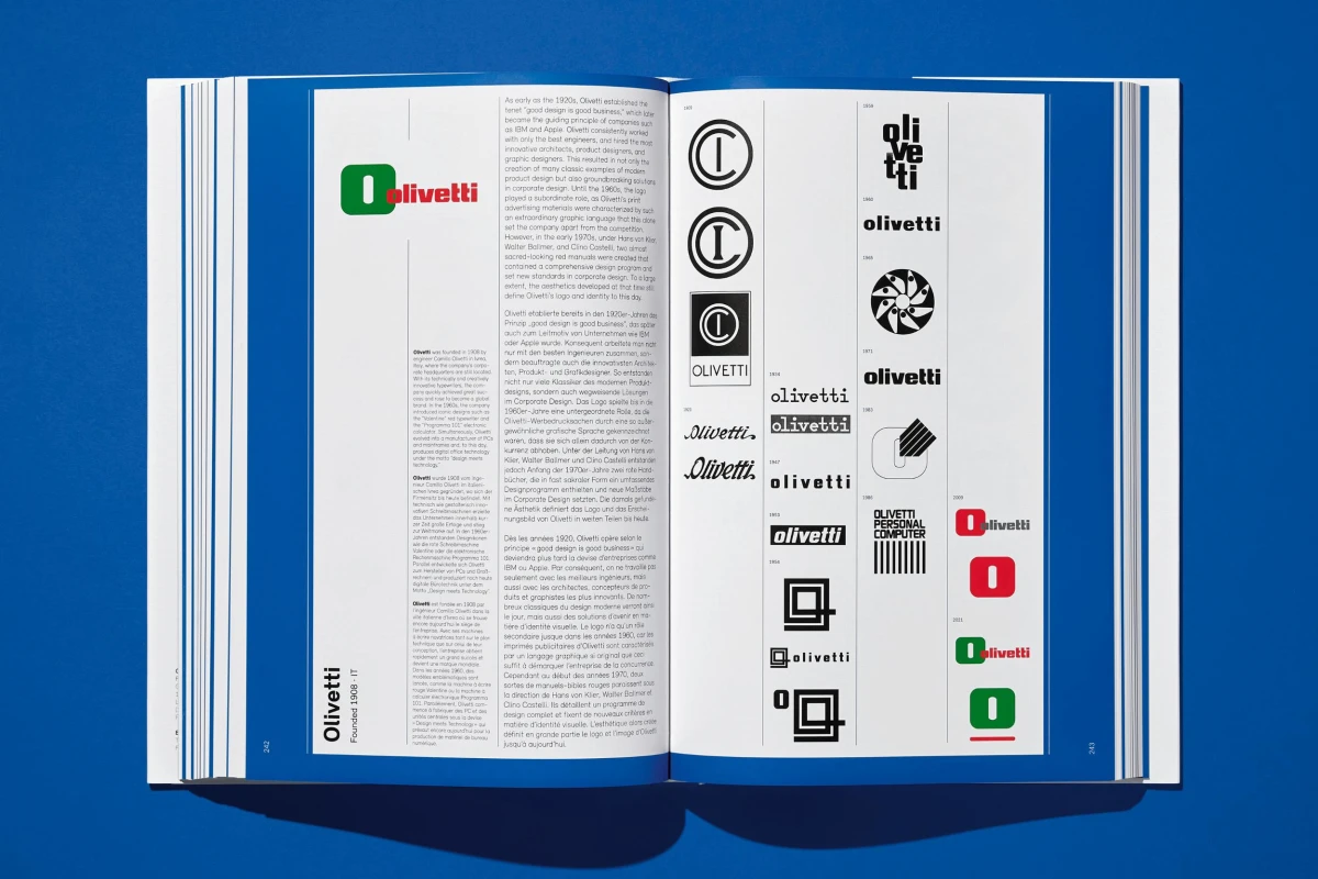
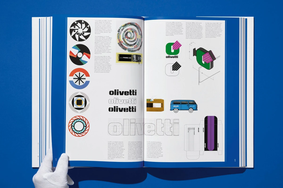
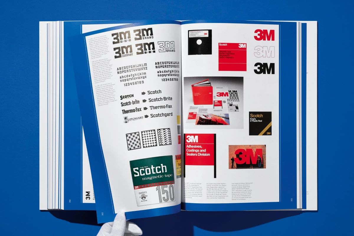
Along with an extensive picture section, the book comprises an introduction by Jens Müller on the history of the trademark as well as a reproduction of the first comprehensive examination of modern corporate logos: the influential design pioneer F.H. Ehmcke’s (1878–1965) illustrated essay “Wahrzeichen—Warenzeichen” (Symbols—trademarks) from 1921. Also included are ten case studies of famous trademarks, including those of 3M, NBC, Shell, and Olivetti, and numerous rare images illustrating the—at times varied, at times consistent—developments in international logo design and the birth of the corporate identity. Logo Beginnings is not only a fundamental and inspiring graphic design manual but also an excellent read for anyone interested in social, cultural, and corporate history and the fascinating impact of trademarks. It is also the perfect complement to the TASCHEN classic Logo Modernism.
The author
Jens Müller was born in Koblenz, Germany, in 1982 and studied graphic design. Recipient of numerous national and international design awards, he is a partner of Vista design studio in Düsseldorf and professor of corporate design at the Dortmund University of Applied Sciences and Arts.
Logo Beginnings
Hardcover, 24.6 x 37.2 cm, 3.69 kg, 432 pagesISBN 978-3-8365-8228-5
Edition: Multilingual (English, French, German)Download product images here
No reviews have been posted for this item yet. Be the first to rate this product.

